The FINSYNC Platform
Overview
FINSYNC is a Platform that provides financial management services for small businesses such as sending and receiving payments, accounting management, financial management, and payroll (think Quickbooks). While QuickBooks and other accounting software offer their customers banking, FINSYNC partners with banks as an additional offering ensuring they have an option that secures sustained customer retention.
The Challenge
FINSYNC had been using the same software they had been with for over 10 years. It was out of step with modern software conventions that users would anticipate in their navigation. In addition, after some heuristic analysis it was apparent there were many redundancies in the navigation, and there was no real design principles that were consistent across the product and all its different silos. In addition, the company’s engineering team lacked the bandwidth and resources to redesign the product, so our design team needed to work with them to integrate the legacy system into a new system without doing a complete overhaul.

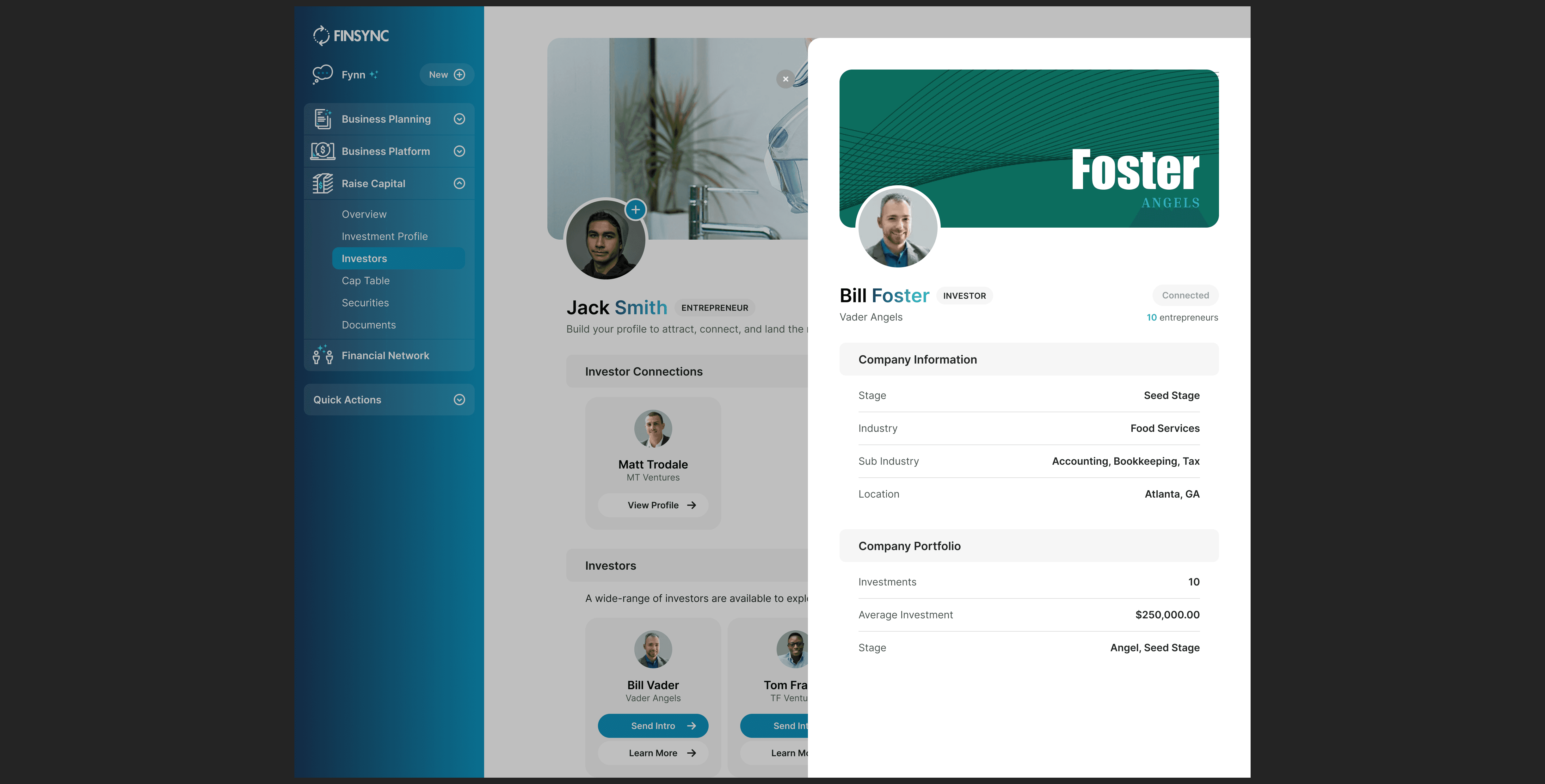
(View above - Before new left nav)
The Approach
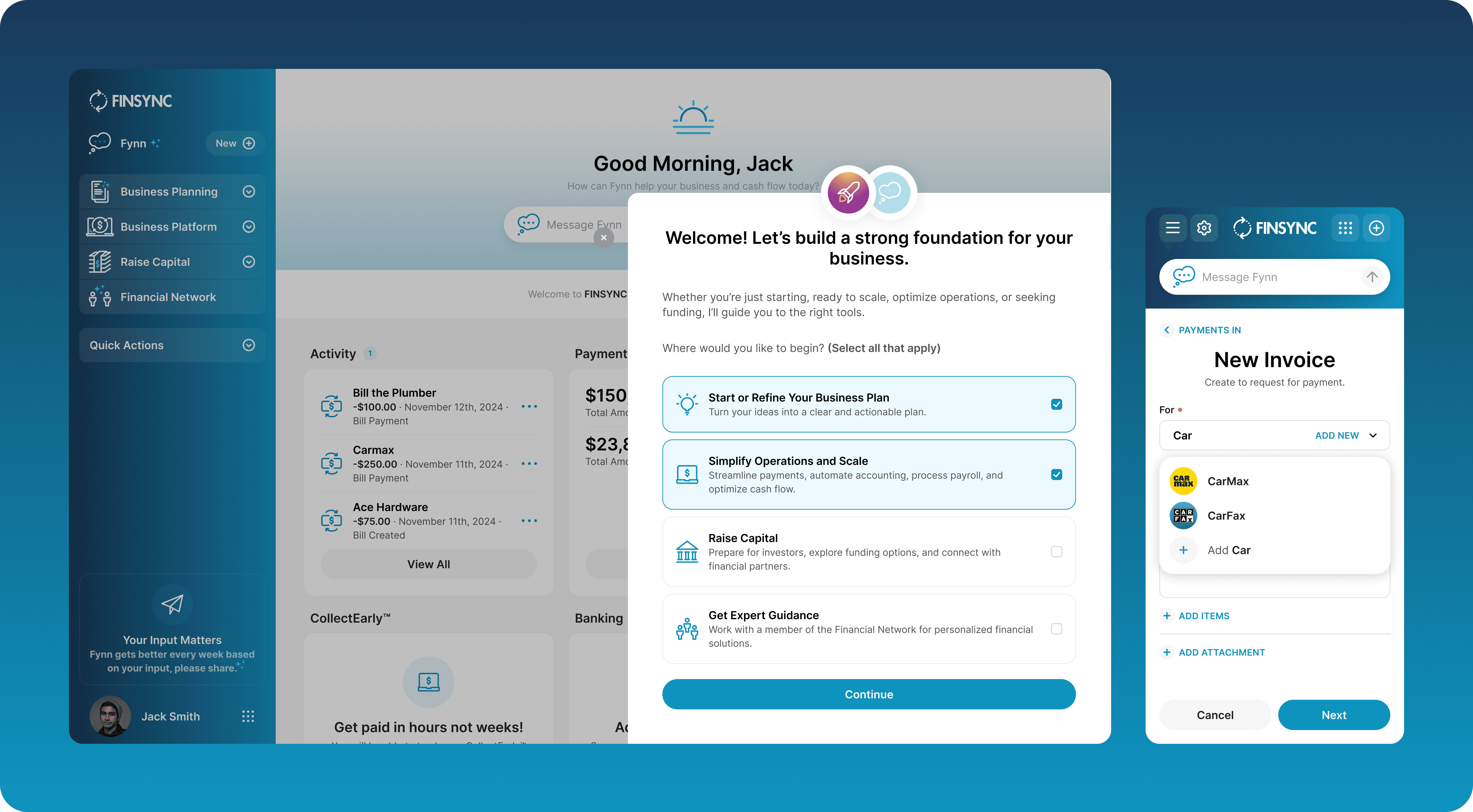
To solve this we came up with a new mobile first approach that would scale down the current version of the product and limit it to our more basic features. To do this, we met with key stakeholders and followed user visits through our FullStory Accounts to understand the most active functions of the product and started with those. In addition, we set out a series of goals to reduce clicks, isolate the navigation and actions with logic and design guidelines, and make a more intuitive sign-up experience.
User Testing
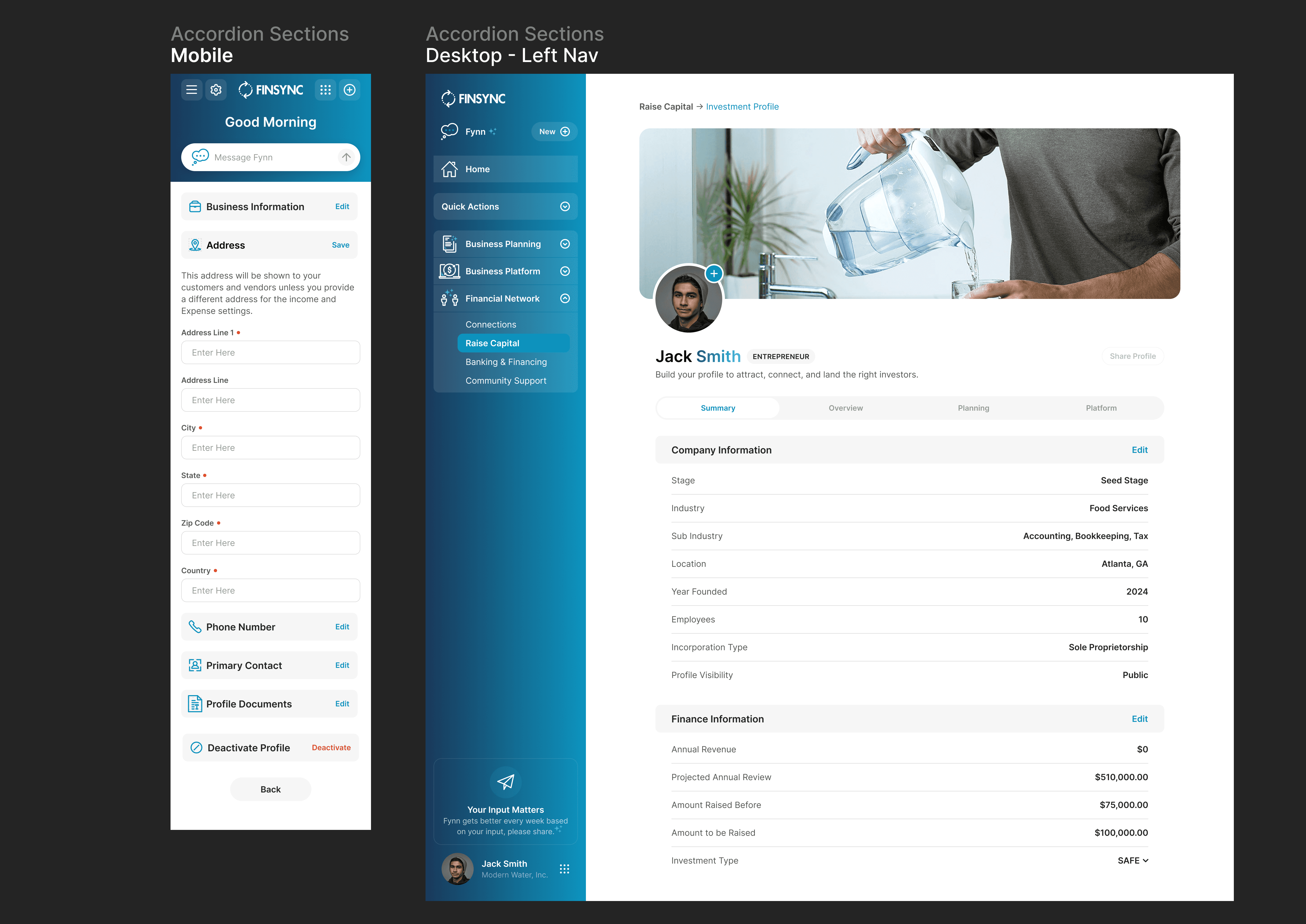
We experimented with various layouts to try to understand the best navigation experience that would enable the most ease of use as well as allow for scalability as we added more features. By creating a new left desktop navigation with accordions we were able to consolidate our navigation into one location and create a working canvas on the right side of the page. We also implemented accordion buttons in mobile that helped us save more space and allowed our users to more quickly find the sections they needed without scrolling and scanning.

Exploration
In addition to accordion buttons we experimented with new drawers added inline editing. These were a great solution to replace the modals that we had in place for a few reasons:
With inline editing they took up less space and allowed for more visible content on one screen
They allowed us to embed sections, making it faster for users to scan groups of categories
They enabled users to continue to scan left side content while a modal would take up the full screen
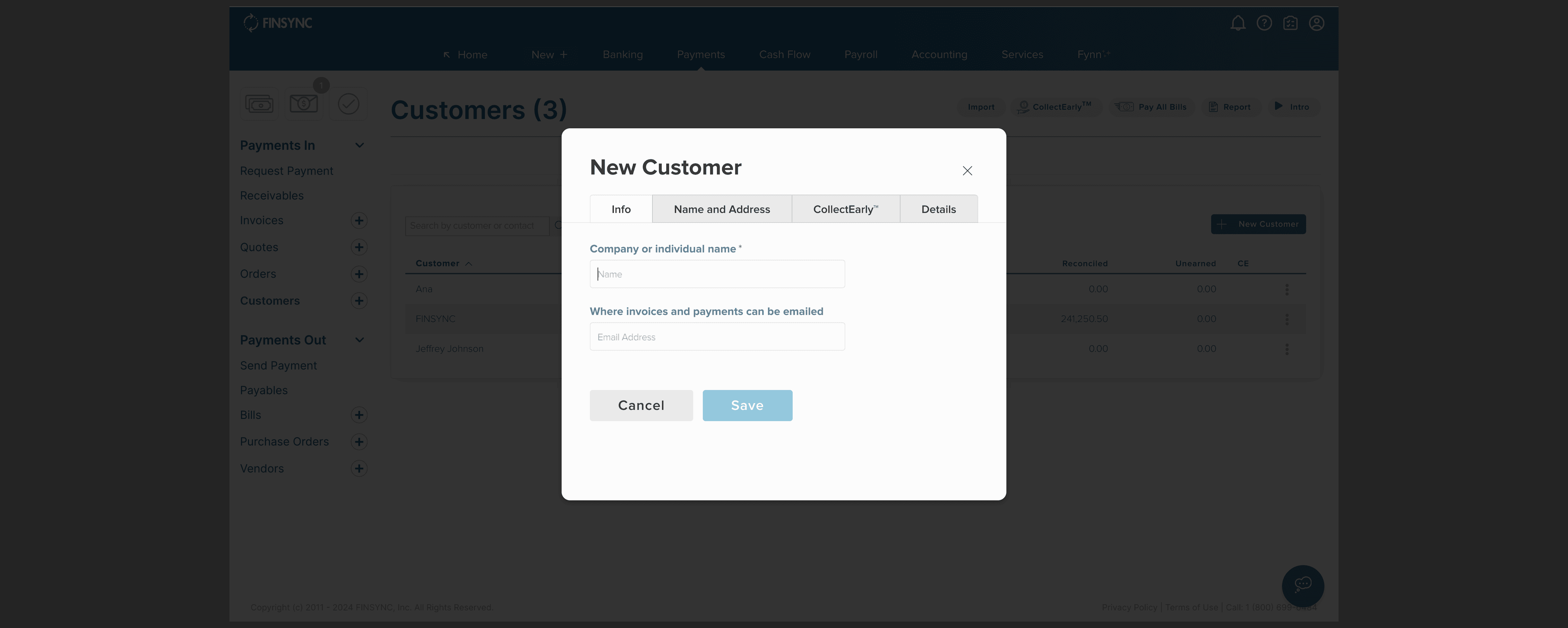
Original Modal Design ⬆️
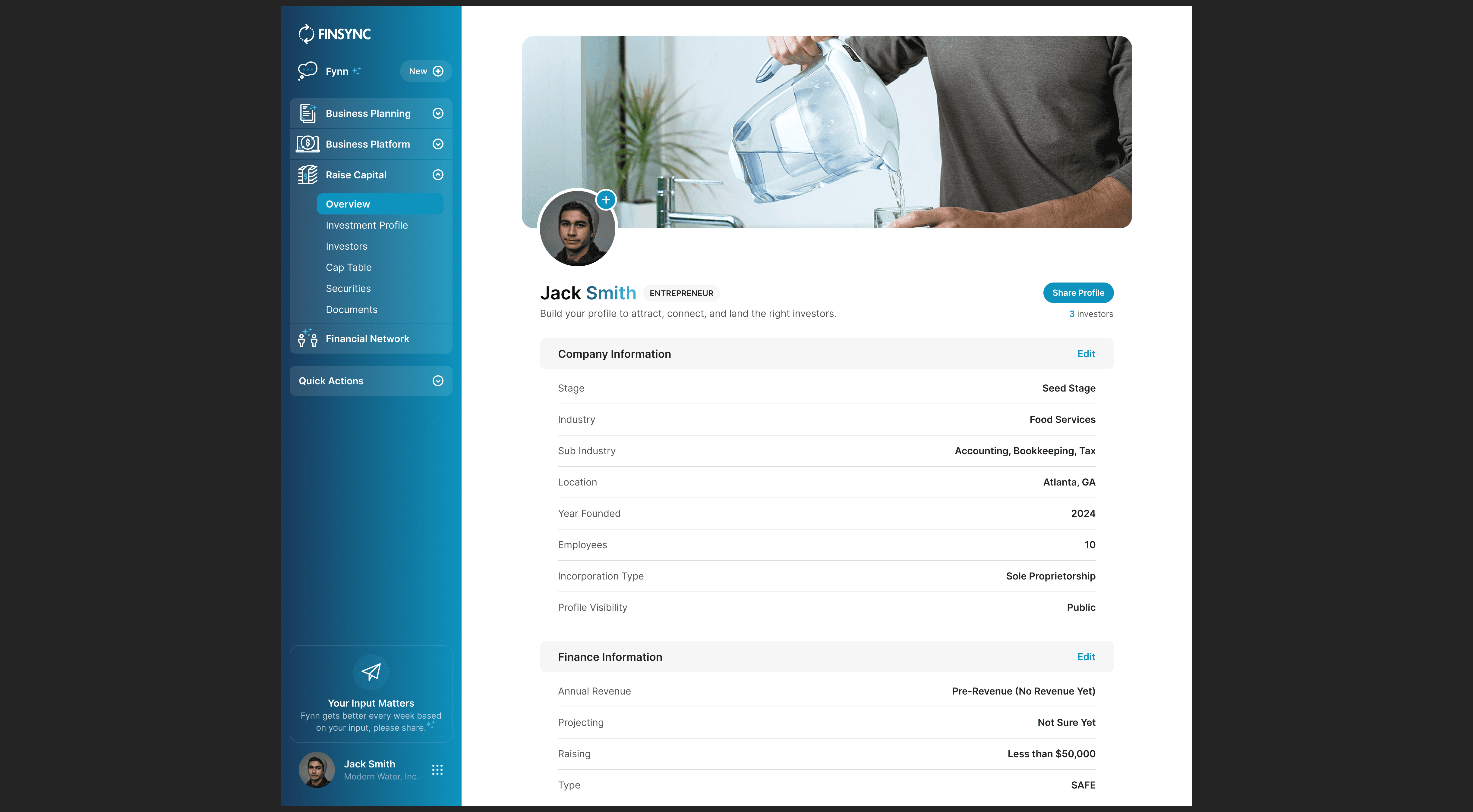
New Inline Editing Design ⬆️
New Drawer Profile Sharing Design ⬆️
Results
In beginning to migrate the legacy product into a new system we have been able to meet one of our team's core design principles: Allow users to complete their jobs to be done with the minimal amount of steps, clicks, and screen changes. The results are still ongoing and there are many functionalities we still need to thread into the product from our legacy system so our data may be biased, but so far we have been able to improve the speed for making payments and other core operations by over 40%.
